Retina Displays @ Only 2 Pixels per Inch

http://www.flickr.com/photos/daveh/102546204/
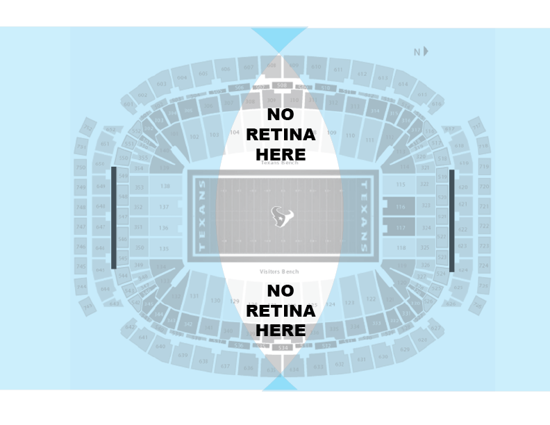
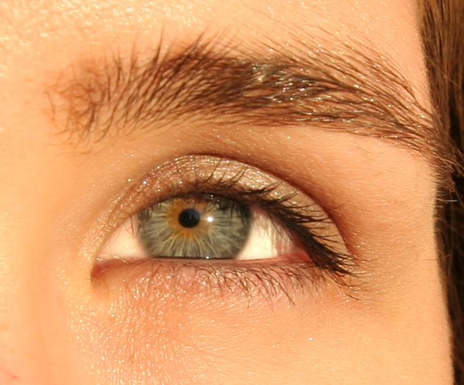
We all know that Apple coined the term “Retina Display” to describe their high density displays for iPhone.  The screens for mobile devices at the time were hovering in the 120-150 range for most handsets, while the retina screen for the iPhone clocked in at an impressive 326 PPI (pixels per inch), it was heralded as a great breakthrough for visual fidelity and accuracy.
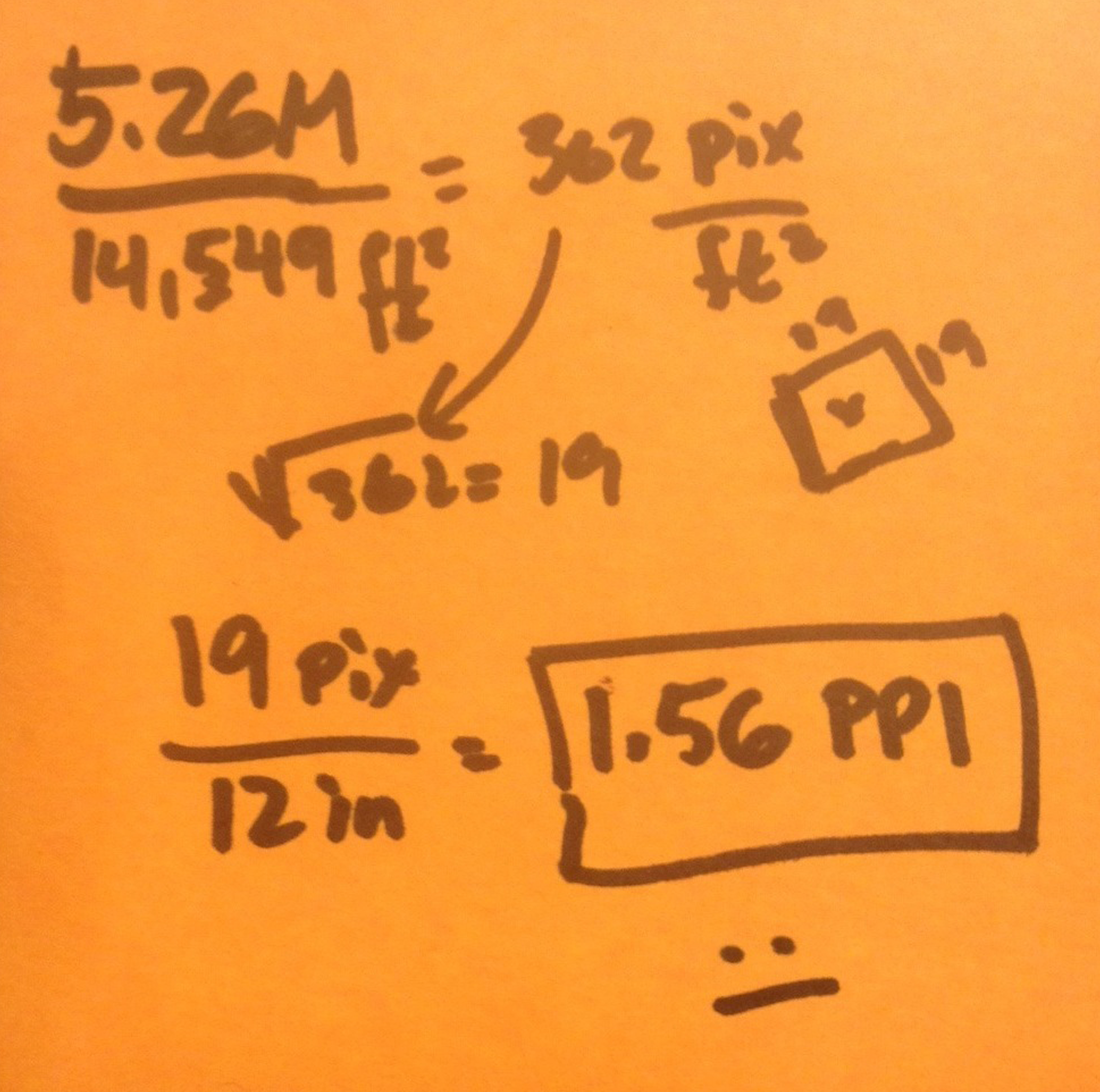
Jobs, ever the master of marketing, claimed that this was a screen grain so small that the human retina couldn’t resolve individual pixels, and thus the name.  From there, erupted a great debate about what “retina” actually meant, some saying it was the End of Pixel Density Innovation Forever For All Practical Purposes, and others claiming it was just a meaningless marketing fluffymumbleword.

(Fluffymumbleword™  is a meaningless marketing term trademarked by SimpleContraption).

Since then, I’ve encountered some who think that anything over 300 PPI is retina, and by extension, anything under that can’t be. What might come as a surprise is that retina isn’t an intrinsic attribute of a display – it depends on the size of the pixels and, critically, on the distance you’re standing when you’re using the display.  A retina display can become non-retina if you get it too close and a a very low density display suddenly can become retina if you back off far enough.  

How far do you have to go?  And how does that work exactly?

To get to this, you have to realize that it’s not the absolute size of the pixels that matter, but the apparent size.  How many degrees of visual angle does a pixel take up?  Turns out there’s a magic number of pixels-per-degree in your field of view – the eye simply can’t see more detail than that.

The magic number of pixels per degree is called a visual acuity limit, and it’s a somewhat elusive number that depends on lighting conditions and individual variances in eyesight (some of us are just carrot-eating eagle eyes, right?)   But as a fair starting point, we can say this:  if a display’s pixels are small enough and far enough away that you can cram 50-60 pixels into each degree of your field of view, you’ve got yourself a retina display.  Steve jobs liked the number 53 pixels per degree even though academics often throw around 60 PPD sometimes.  Let’s not sweat that nuance. It’s in there somewhere.

That means that close-up displays like hand-held phones need really high PPI while further away screens, like desktops can still be retina displays even though they have lower PPI.

Some background math on this and some sample PPI data and distance data can be found here.  Of course, Wikipedia has some good background on Retina displays too.

OK, so how weird can this get?   What about really low DPI screens that are really, really big, but very far away?  Is that even a thing? Could that be a retina display?

Yeah, that’s a thing.  It’s a really big, awesome, amazing thing.  And it’s crazy low DPI is actually a retina display.

Meet the new display at the Houston Texans’ Reliant Stadium.  Details about this displayzilla are here at the Verge with some additional coverage here at Gizmodo.

This beast is  277 feet wide and over 52 feet tall. That’s 14,549 square feet… but get this;  all that area only hosts a modest 5.28 million pixels.  That’s like a paltry 2-1/2 HDTVs worth of picture smeared over a third of an acre for an entire stadium to look at. 

What’s the PPI on THAT?

well…

postit

5.28 M pixels over 14,549 square feet = 362 pixels per square foot.  That’s 19 Pixels per foot on aside or about 1.56 pixels per inch.

That’s one VERY low density display.

“How can that be retina?” you might ask.   The answer to that is, as we now know  “sure, depends on where you sit, bro.”

(The “bro” part is required for technical correctness that we can’t get into here.  Trust me.  This is science.)

Below is a map of Reliant Stadium and if you look here,  you can see a picture from the field of where these gigantic displays are mounted inside the facility.  I’ve made a fair guess where those displays mounted.

I'm guessing as to the location of the screens here.

I’m guessing as to the location of the screens here.

For a display of 1.56 PPI to present 60 pixels per degree to a viewer, that viewer would need to back off a full 435 feet.

The good news is that this stadium is plenty big enough for that to happen.   The zone in the diagram below marks the seats that are more than 435 feet away from the center of the north display.

Reliant_Stadium-retina-range_01

Not bad coverage.   Remember, the PPI is still only 1.56, but the angular density is well above our magic 60 pixels per degree for the people in blue.

Now, I am not 100% sure that the stadium sports  monster displays at both ends of the field, but if it does, the people at the other side of the stadium  get a good retina display to look at, too.  Like so:

Reliant_Stadium-no-retina-here

Mind the gap! No retina in the middle These poor guys are too close to both displays – neither of them will have retina attributes at such close range.

But mind the gap!  Poor bums in the middle – the ones on the 50 yard line – are not far enough from either screen to get a good retina experience.  For them, the pixel grain of both screens ought to be evident (anyone in Texas out there who can validate this? I’d love to know!)

The moral of the story is that you can get retina displays even when the screen density is super low.

Extra credit:  What’s the PPI rating of a retina display on the moon?   What would the overall resolution be?  And how big a message could Chairface Chippendale carve if he wanted to?

Designer Recruiting Season! A Few Tips From an Interviewer

TL; DR

Keep it short, practice your pitch, know why you design the things you’re designing.

It’s Recruiting Season!

Rabbitseason


So you know, I have totally re-written this dreckish article to be more concise, clear and with somewhat less dreck.  The new version of this topic is now hanging out on Medium, because I wanted to give that a try.

Go here to my Medium Article to see the better version.

thanks!

Matt
November 16, 2015

Design students everywhere are interviewing for internships, co-ops, and full time positons, showing off their portfolios and describing to recruiters what makes them tick as a designer. 

My employer, frog, commonly attends these recruiting events, and is always on the lookout for bright, mutlitaletned superhero desigers. I just returned from one of these events and thought I’d share a few thoughts about interviewing with a portfolio of design stuff, with a focus on what you need to do to prepare for the 10-15 minute lightning-round window of attention that defines campus interviews.

Hints for Candidates:

  • First, know why you designed the thing you’re showing me, and explain why it was important to solve it. 
     

    I know you’re in school and sometimes projects are, at their surface, just an excuse to get experience in a specific design technique or technology.The job of your teacher is to expose you to these various techniques, but remember, your job is to integrate new techniques and skills into the deeper, larger process of doing design, and to figure out how any given project’s outcome is a design exercise worthy of the effort, apart from the techniue that was used to create it. 
     

    If all you can say about a project is “this is where I learned [flash, contextual inquiry, agile co-design blah blah blah] then you’re just doing homework, not doing design.  Be sure you can explain to your interviewer this larger picture of why the artifact you’re showing is a BFD.

  • One way to get to get at this is to describe each design effort you do like this:  

“So, the work I want to talk to you about is a <thing, service, interface, process>, designed for  <some sort of person/group/demographic/audience>  so that they can  <solve a problem, do something interesting,  remove a pain, feel a certain way, achieve or triumph in a certain way>.  This has never been done before because <provide reason or caveats about simplicity, cost, complexity> and is important to solve because <provide rationale>.”

If you can’t fill in those blanks,  you don’t know your project well enough.   

Notice how, if you do that, then you are perfectly set up to go on to THEN talk about the process, the approach, and what you, personally learned in the context of doing the work, which is totally OK.  But note how the horse is in front of the cart when you frame it first as a real design challenge.

  • And while we’re talking about process: don’t be shy about showing sketch work or scribbles or how you got to your finished answer.  A slide or two goes a long way to showing what your hand is like, how you think visually.
  • Start your interview confidently by taking initiative in the conversation.  Seriously, this is 15 minutes about you, really. You can start by telling your interviewer me up front what you want when the interview starts. “Hi, I’m Alice and I am looking for an internship.”  Nothing wrong with being forward. 
  • Have one thing you want me to know about you – what is your best work? Don’t try to bounce around between three things.  There’s no time.
  • Practice your pitch. 
  • Practice your pitch.
  • Practice your pitch. 
  • Can you describe your best work in 10 sentences? Now do it in 5. Now 1. Elevator pitches vary depending on the length of the elevator ride. 
  • Have a resume or a physical from of portfolio you can leave behind.  Your interviewer is going to have a long plane/train/car ride home and will appreciate having something to remember you by in the days ahead.
  • Resumes should include your first and last name.  (Really.)
  • Resumes should have a link to your online portfolio. (Double really.)
  • You do have an online portfolio, right? Consider putting your face on it somewhere.  It helps people remember you.  Make sure I know where this online presence can be found – put the address on your other leave-behinds.
  • When showing me work from your online portfolio, ask yourself:  are the images and assets this site serves up big enough for a newcomer to actually evaluate?  If your best-work-ever comes up in 320×240 thumbnail format, your effort looks small and easy to dismiss. Don’t let the defaults of favorite online portfolio platform undercut your efforts.
  • Be able to show something that’s totally yours. I know this is hard with group projects, but you have to be able to express what your contribution was to the larger effort.  Showing a smaller side project you did by yourself is a fine trick.
  • To that point, when you are asked what you contributed to a given project, please don’t say “ideation.” Having good ideas is important of course, but it’s not nearly enough.  Of course you contributed ideas.  I assume you are creative.  Show me what you do in group projects. Ideation isn’t a contribution when it’s decoupled from execution. 
  • Show me you care.  Show drive, passion, and a thing that  Matt Walsh from CP+B brilliantly refers to as “bounce.”  Some people are quiet, introspective types,  and that’s ok. Be yourself.  But find a way to communicate that there’s something in this line of work that is a calling, not just a job. 
  • Consider a business card.  You’re a designer.  Make a statement.  Even if your statement is, “I don’t design business cards.”
  • A cover letter is nice. Probably better than you *write* one for your own thought-organizing purposes than anything else.  Keep it short. Ask yourself, “would I read this if I had 20 of them?” 
  • Practice… oh, you know. 😉

OK, that’s a lot, I know. 

I’m sure there are other points I am missing and I would love to hear everyone elses thoughts for tips and tricks that candidates (and interviewers!) can take to heart.  

Leave your ideas in the comments.   Thanks!

Wireframes Must Die.

The TL;DR version

Wireframes suck. We should stop delivering them to our clients and strive toward a design artifact that goes beyond a simple prototype, something I call a design model.  Think of a design model as a cross between a live, parameterized prototype, a wiki for annotation and commentary, and a documentation database. 

The Slightly Longer Version

Instead of wireframes we should dare to imagine a new, better sort of design artifact, powered by a set of tools that bridges the design chasm between the napkin scribble and full-on production code. Today, we fill that chasm with scads of paper documentation populated by simple line drawings with lots text.  

This isn’t design.  This is paper documentation depicting static poses of a dynamic experince;  a 19th centrury answer to a 21st century problem. It is, like the wise man said, dancing about architecture.

Instead of wireframes, we must invent proper UX Design Modeling tools, and deliver a design model of real software to our clients as the engineering precursor to production code.

What Others Have Said

The value of wireframes has been a topic of tweetery and blogmongering the last few years by a growing chorus of eloquent voices: Andy RutledgeChristina Wodtkeand Jason Kunesh to name just some. Each of these writers is like a gardener lifting out a single shovelful of earth, collectively and perhaps unintentionally diggging a neat little grave for traditional wireframes. 

Andy moves the most earth in this task, arguing passionately for several things: 

  • that wireframes often don’t express what we want (motion, emotion, sound, transitions)
  • that they often express things we don’t want (typography, placement, copy)
  • that they often confuse clients by foolishly separating visual design from interactive design
  • that wireframes are mostly useless for daring, visually-driven designs
  • that interactive prototypes are often a better way to express design intent

Yes, to all these things.  (Apologies to Andy if I didn’t capture his arguments fairly.)

And To Pile On…

And in my view, that’s just the start. I add:

  • wires are brittle in the face of seemingly simple change requests. A single “fix” can ripple work through hundreds of pages of wires because there’s no way to describe relationships between things (“this thing is always x pixels away from that thing”) in simple, non-parametric drawings.
  • wires don’t have a graceful path to building prototypes or usability artifacts (building such things often means rework in code).
  • wires can be difficult for clients to read properly, prompting questions that wires can’t answer, busting expectations.
  • wires don’t age gracefully. Clients often ask that wires be kept aligned with visuals (because clients get confused even if we don’t). 
  • wires are often impossible for VIP stakeholders to read (but waiting for the full visuals is often too late to take in feedback from this set of stakeholders).  We need a way to drive toward tentative visuals early in the process while there’s still time to react to feedback. 
  • wires can be difficult for designers and clients to annotate as a group. (this is a flavor of the version control problem)
  • wireframe documents (Illustrator, Omnigraffle, etc) don’t integrate well or at all with more formal issue tracking tools, useful for the monster-sized projects. 

I could go on like this…

    And still, in spite of this, clients keep asking for wireframes and we keep obliging. Mostly, I think, because there’s not much we can offer as a better alternative.  Our clients deserve a better answer.

    This, my friends, my fellow cap-D-Designers, is a Design challenge. Perhaps a challenge that threatens to redefine our craft.  Fine by me. Bring it.

    Sketching Is Still Important

    I want to be clear: sketching static wireframes with pen/paper/postits and whiteboards is still necessary as an internal communcation tool and “thing to think with” a way to solve problems – the cocktail napkin still has a role to play in our design process. I am arguing that our design thinking should be delivered to clients in something other than fancy napkins. 

    Modeling Tools for UX 

    If wireframes are to die as a deliverable, we have to answer the softball question: what would be better than wireframes?  

    Our designed objects are living, breathing systems, our deliverables should be too. We should move away from documents and toward the notion of a tool. This tool isn’t a programming tool, but has aspects of it that look like code.  It isnt a drawing tool, but has parts that look like common drawing tools and can consume assets from common drawing packages. It’s much more of a “what-if” engine – a thing that lets you noodle with options as you go.  It’s parametric, so you can plug in variables and watch the design change.

    Like CAD for UX.  More than drawing.  Less than programming.

    I’m talking about a modeling tool for user experience.  

    A Single System, Many Views

    This modeling tool is one that supports the construction of a single, integrated design artifact, interconnecting logical screens with visuals, transitions, audio events, annotations, review notes, data feeds, and business logic. Parts of it are code, to be sure. Parts of it are drawings. Parts are excel spreadsheets.  Parts are driven by live web services.

    It allows for progressive refinement of a design and, when released to a client, acts as a living, breathing spec and reference prototype all in one. The databases that contain the information can be brought togehter to create many different views, different design artifacts that help express Design Intent.

    The first core idea is that the model can emit many renditions depending on the need.  The skin can start as hand-drawn sprites, and move to hardline vectors or visually-realized designs as they become available. Pieces get augmented logically, never redrawn. Visuals rise in fidelity, but can always be rolled back to monochrome/line drawing versions to emphasize behavior over visuals when that’s necessary.  Transitions can be layered into the system in place. This is about progressive refinement, not re-work.

    Ce-ci n’est pas (de) Rapid Prototyping 


    [tip of the hat to friend @maartend for fixing my pseudofrench]

    OK, so far this just sounds like rapid prototyping. That’s half of it, but perhaps the less interesting half of the Design Model. This is about blending the interactive prototype with a rich annotation engine that allows designers to add a metadata, a conversation about the prototype that is as interactive as the prototype itself.


    That’s the second core idea: the running model can be annotated. It can support callouts with labels and these callouts themselves can be video, voice over, text, links to other assets or pictures. The callouts can be data-driven from the behavior of the model (“when the <persona x> clicks on the <button youjust pressed> they see <screen Y>”).  

    These callouts can serve as the official documentation for the model (like a traditional wire), or review commentary from the team or the client.  The wireframe, standing upright, opposable thumb firmly wrapped around a better tool, all evolved and ready to kick some static documentation ass.

    What a Design Model Supports

    With this basic idea in mind, think about what a Design Model might look like: 

    Authoring Side

    • it has an authoring side that looks like a drawing program, supporting system construction both in terms of interaction models, template pages, but visual systems of colors, type, lockup and gridlines. 
    • it encourages visual designers and interaction designers to solve the problem together by giving them access to the same tool. 
    • it lets designers express transformations and transitions between static states and to get that information into the system early, not late.
    • it has a ready-made set of common, mock databases/feeds to supply things like address books, contact cards, sample SMS messages, emails, videos etc..that feed the user experiences we make. Of course, there’s an extension mechanism to create custom collections. 
    • it has a way of expressing external events that exist outside the software experience – friends coming online, dropped calls, page not found, etc. Again, the event model is extensible as new interaction models are everywhere.
    • it uses instances everywhere: any logically unique object in the experience is instanced out of a symbol library or template. These masters are parametric and referenced – changing them cascades changes all through the system. This approach enforces consistency and is able to produce, as a side-effect, a list of every dialog, every control, every animation, every cut asset and every variant or exception to the system. This modular and abstract way of working will be a new challenge for designers, but a challenge that we are ready for, indeed, begging for.
    • it supports the construction of a glossary of terms – every project I’ve ever been on has created or used words that were wholly new or unique to the client.
    • it supports writers with spellchecking, layout, consisency-checking tools. Ideally, it would have a workflow mechanism to support the traditional writer-editor-proofer cycle.
    • redlines, if they exist at all, should be expressible by the system automatically, or with very little user-input, much like modern CAD software dimensioning. 

    Playback/Review Side

    • it allows the connected screens of visualized wires to play out for stakeholders, usability subjects, design teams doing internal critiques. 
    • Screens can be collected into use cases that are reflected and cross-referenced to business requirements, but they don’t exist as context-free drawings, but logical states of the model. 
    • Annotations and callouts can be turned on and cross-referenced with business requirements, appearing as a side-bar to the running model, or in a separeate rendeirng layer.
    • Reviewers can leave notes on any screen, in any state of the model. 

    The Design profession is decades old now. We have a much clearer picture of what we need – it’s about time we have some Computer-Aided Modeling tools that directly support and automate what we do. 

    But Don’t We Already Have…?

    No. Not really. The pieces are in place, but the Computer-Aided Modeling solution eludes us. I hope the picture I am starting to paint here makes it clear that the possibilities are beyond what any of our tools provide to date. 

    Illustrator, InDesign, Omnigraffle, Visio, Catalyst and the like are not Computer-Aided anything. They’re just making drawings with computers. They really don’t aid us at all.  Yes, I know about symbols and the click-through and interactive features of these packages, but this is pretty weak sauce and falls short of a full-credit modeling solution.

    Microsoft Expression Studio is getting closer to the mark, but it is a Silverlight/ .NET Microsoft-centric beast of a system and is sitll incomplete.

    Axure and iRise get other pieces of this vision right, emitting requirements docs derived from the wires, but they’re still very wire-framey in nature and not parameterizable and customizable enough to capture what I’m talking about. I will admit that my view of these two tools is possibly stale and I would invite others with more experience to chime in with their experiences. 

    Other Designers Are Thinking About This

      Turns out there’s an analogous conversation going on in the world of architecture – a growing interest in BIM – Bulding Information Modeling that combines the graphical depiction of a blueprint with backend data that allows designers to estimate building material and schedule costs as changes are made to the blueprint.  This is clearly a higher-order thing than just a blueprint. 

      Where We Go From Here

      I want conversation, questions, debate and a clearer picture of what this tool might be and how existing tools do and don’t quite realize this vision.  I want specifically to talk about how a tool like this can get us to work in a more high-fidelity visual language earlier than we ever thought possible.  We owe it to our clients to speak to them in a visual language that speaks to both the head and the heart. 

      I’m convinced there’s something more we can do than the current state of the art.  We can and must do better.

      We must dare to be great. We must dare to imagine tools that are as supple, expressive and reactive as our imaginations can allow. We must listen to ourselves as our own customers and step forward with a proposal for higher-order design and production tools.

      Then we must stop creating wires. 


      Chartwell – A Font For Visualization

      Media_httpwwwtktypeco_aeqnf

      TK TYPE has a font called Chartwell that can be used to make simple pie, ring, bar and sparkline trend charts by exploiting the OpenType ligature features of your favorite publishing platform (e.g. InDesign).

      You type values as normal numbers, coloring them as you like, concatenating them with “+” signs to make a chart, then turn on ligatures in your software. BOOM: Graph.

      This is easily too clever by half. Which is why I love it.

      OK, I got me a hammer. Where’s them nails at?

      The Run Of The Very Grand Mill : Automatic Mechanical Self Replication

      Here’s a fascinating two-parter: part one is an impressive demonstration of order arising out of simple mechanisms and a little random shaking, interacting with the laws of physics to give rise to order, replication and selection.

      Things really take off in part two.

      The lessons here: (1) replication is a simple trick when the conditions are right (2) human perception and expectations are easily fooled and impressed (3) DNA and self-replicating, intent-free machines like it are probably common.

      Our eyebrows go up, while the universe shrugs and says, “meh, that’s just how it works around here.”

      True Size of Africa

      Media_httpflowingdata_gfcid

      Yes, this is comparing countries to a continent, but that’s a pedantic nit that misses the larger point: Africa is fucking huge.

      This is an example of a great (simple) visualization that builds a bridge between the thing you (probably) know – the size of the US, and a thing you probably don’t know – the size of Africa. Comparing continents in the same way to do apples-to-apples would be building a bridge between two unknowns: theoretically correct, but practically less useful.
      Makes me wonder which (screwed up) map projection I’ve been housing in my head all these years.

      Batman Doesn’t Drive a Beater

      Batmobile

      Design challenge:  can you make a feature phone do things that a smartphone does. 

      Verizon thinks you can.

      Verizon Brings Online Account Tools to Feature Phones: Tech News «.

      Personal challenge:  I am I snob for thinking that nobody will actually use this?  Surely the experience of driving through what must be mounds of DPAD-driven UI to get to some obscure DVR-programming ability through your smartphone must be totally suckful.   And who do they think the audience is, these people who  want to do these incredible digerati-black belt maneuvers like ordering pay-per-view movies from your phone, but won’t step up to a smartphone?  Batman drives in a Batmobile.  They go together.  Verizon thinks that sometimes Batman drives a Jetta with a lot of miles on it.

      Or am I being a smartphone-carrying snob for thinking this?